
Seismic for Outlook is an add-in that streamlines sellers’ content sharing workflow
Seismic is a leader in sales enablement platform that helps enterprises maximize seller performance and deliver exceptional buyer experience.
Role
Lead designer
Time frame
10 months (Sep 2021 - Jul 2022)
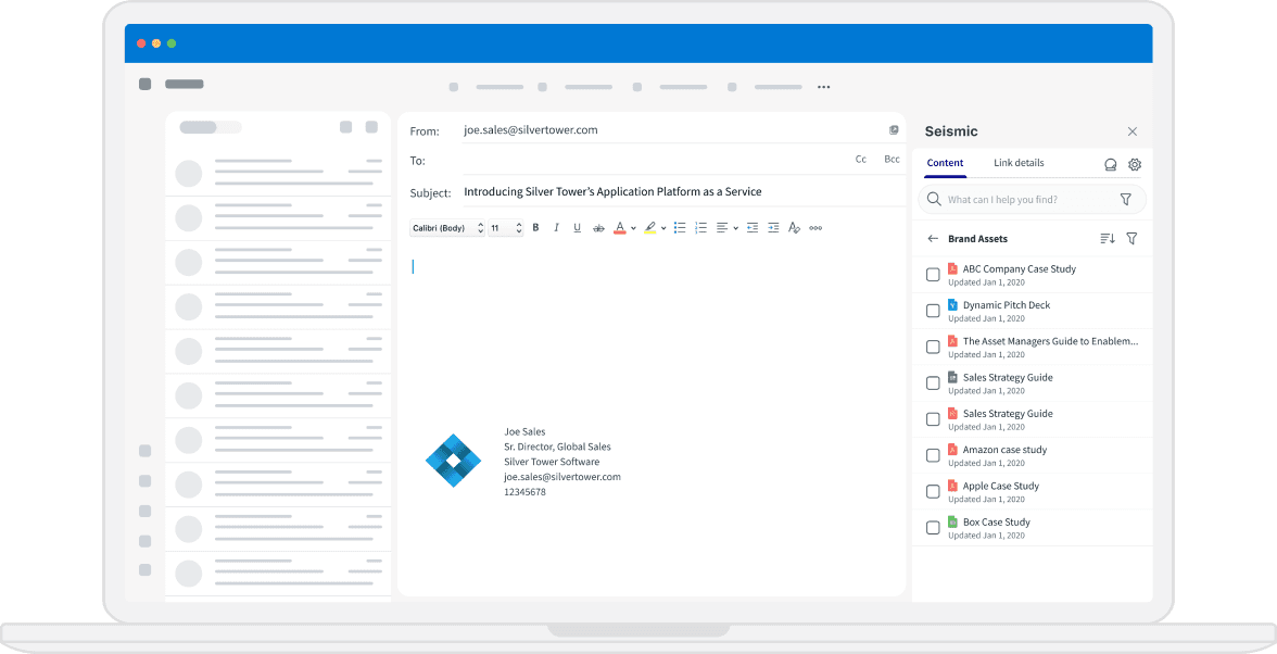
Unlocking Seamless Sales Engagement: The Role of Seismic for Outlook
Sellers practically live and breathe in their email environment, consistently connecting with prospects and delivering deal-moving content. While Seismic's web app facilitates the sending of content via emails, let's walk through a seller's day and explore how Seismic for Outlook transforms their typical routine:

Sellers not only lose time by shifting away from Outlook to create content links, but also miss out on crucial tracking data. When content is sent through a generic shareable link, sellers can't identify who viewed it as the links are not linked to buyers' email addresses.
Now let’s take a look at how the add-in can streamline their workflow:

With the add-in, sellers generate links without leaving Outlook. Even better, the add-in creates a unique link for each email sent. Now, sellers can easily track who viewed their content, accelerating deal closures.
Business and Design Goals
Seismic has two legacy products that fell short of meeting our customers' demands for functionality, a modern UI, and an excellent user experience—all while incurring high maintenance costs. In the upcoming sections, we’ll take a closer look at these two products.
Our objective is to build a new Outlook add-in that not only has all the functionalities of our legacy products but also replace them using the latest technology. This new add-in aims to scale and empower us to introduce new features that increase prospect engagement. My design challenge lies in crafting an intuitive interface within the confines of add-in technology and limited screen real estate. Furthermore, I strive to create a cohesive experience with our web app, leveraging design system components and patterns that Seismic users already recognize.
Evolution From Legacy: Examining Feature Offerings
In this section, we'll dive into our two previous products, which had their share of challenges. Additionally, we'll take a look at a shared component that can enhance the overall user experience.
Legacy Plug-In
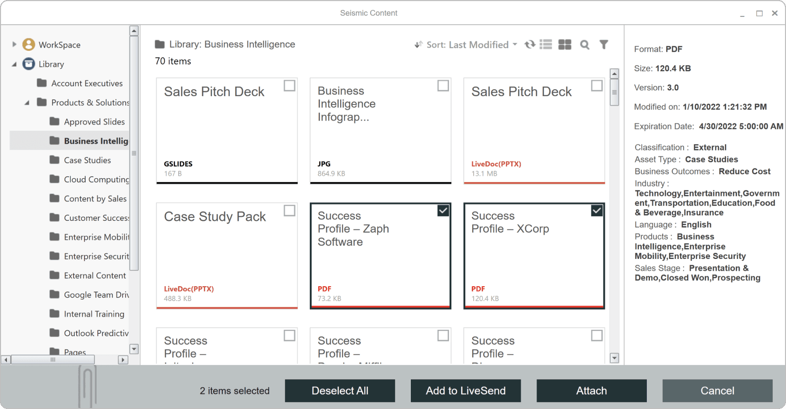
The legacy plugin, accessible through a modal, grants users access to all the content repositories. Once content is selected, users are presented with the options to generate a shareable link or send the content as a file attachment.
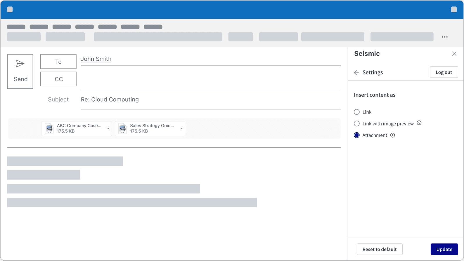
Despite the advantage of receiving viewing data when sending content as a link, it's noteworthy that some financial services companies may prohibit the use of links. For them, sending content as an attachment is a highly preferred and widely used feature.
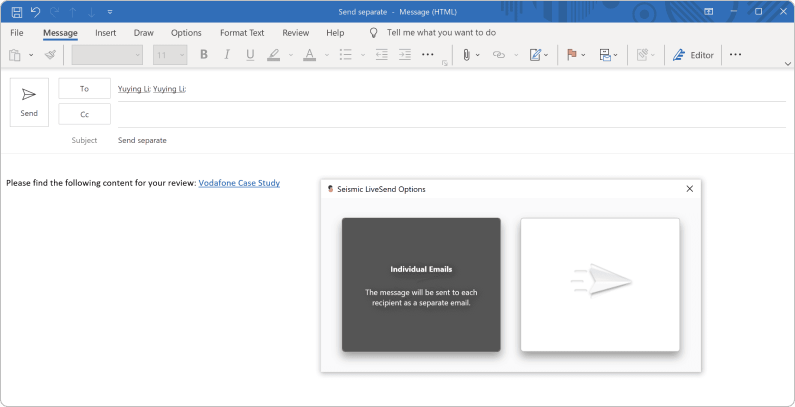
When an email contains multiple recipients and the send button is clicked, users are presented with two options: sending a group email or individual emails.
Opting for individual emails generates a unique link for the content the seller intends to send, distributing it to each recipient separately. This enables sellers to track viewing activity from each individual recipient.
Legacy Add-In
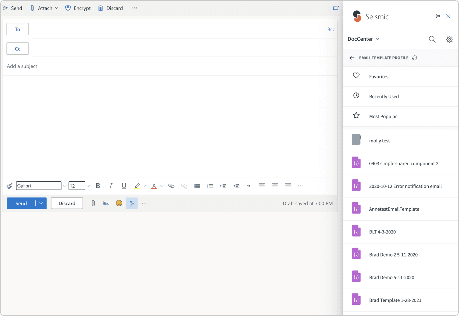
The legacy add-in represented our initial attempt to integrate a more modern user interface with Outlook. However, it fell short in several areas compared to Seismic on the web. Key functionalities such as search and filtering capabilities were lacking, and it also lacked high-use features like 'send as attachment' or the ability to send separate emails when the email contains multiple recipients.
Additional Highly-Requested Features
In addition to retaining the current feature set from our legacy products, there are several functionalities that have been frequently requested by customers.
Bundle Link
At present, our capability only permits each content item to be presented in emails separately. This translates to multiple links in an email when a seller sends multiple pieces of content. This approach can lead to 'link fatigue,' potentially resulting in lower engagement. Some sellers prefer a cleaner email appearance, with a single link including all the content they're sending.

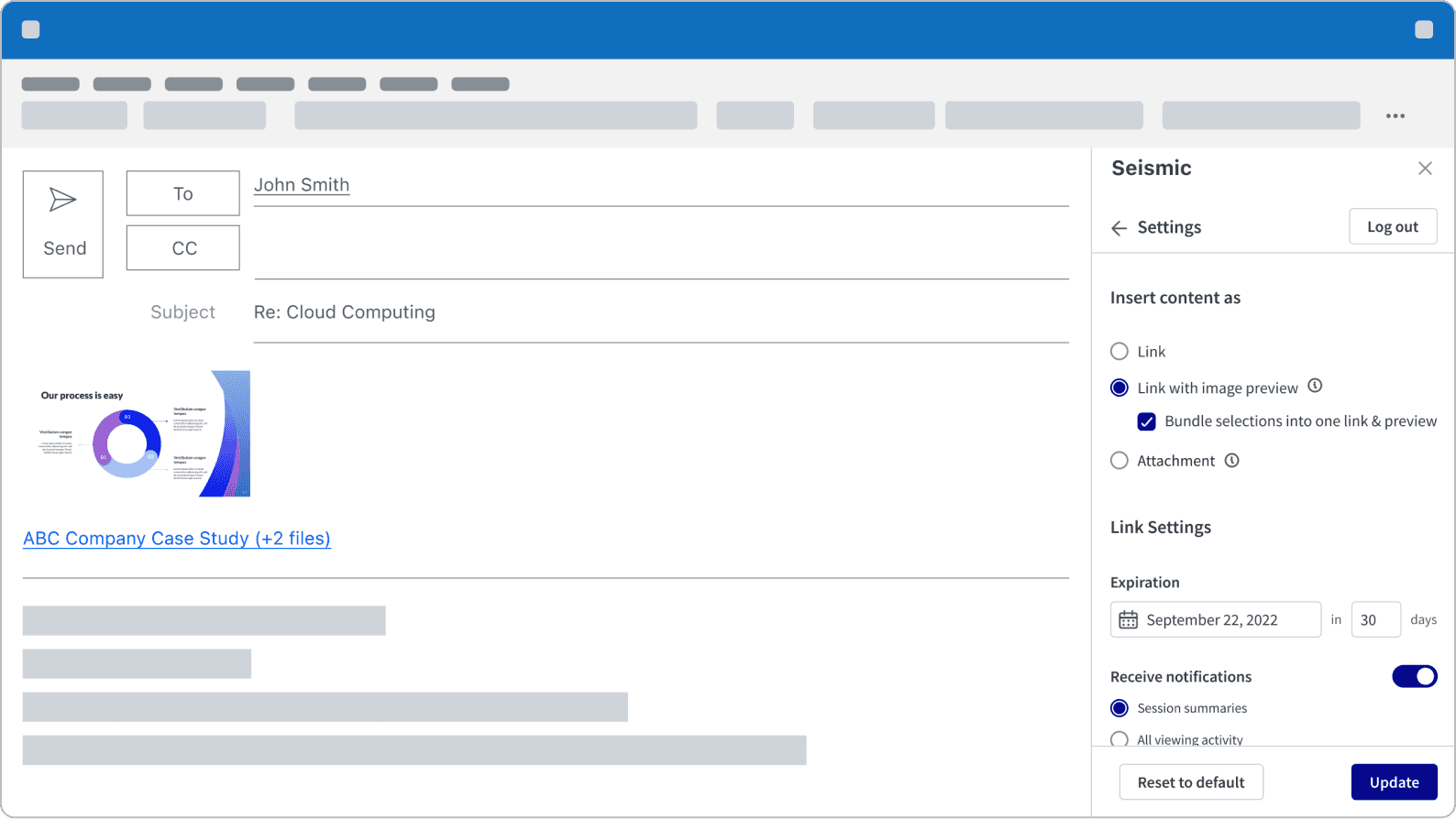
Link with image preview
Imagine a book cover featuring only the title – it might come across as bland. Now, picture a cover not just with the title, but also captivating images. People are far more likely to pick up a book with an intriguing cover. The same principle applies to content. While text links may easily blend into an email, the ability to include an image preview makes the email significantly more appealing, ultimately boosting engagement.

User flow
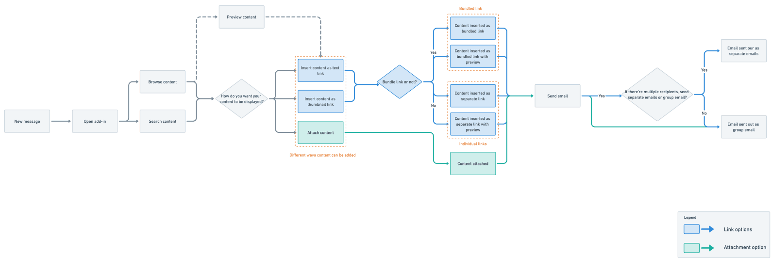
With all features considered, I've crafted a user flow to illustrate the steps users take to add content and send out emails. It's clear that we need an intuitive method to manage choices between links, attachments, bundling, and non-bundling.
Wireframes and Information Architecture
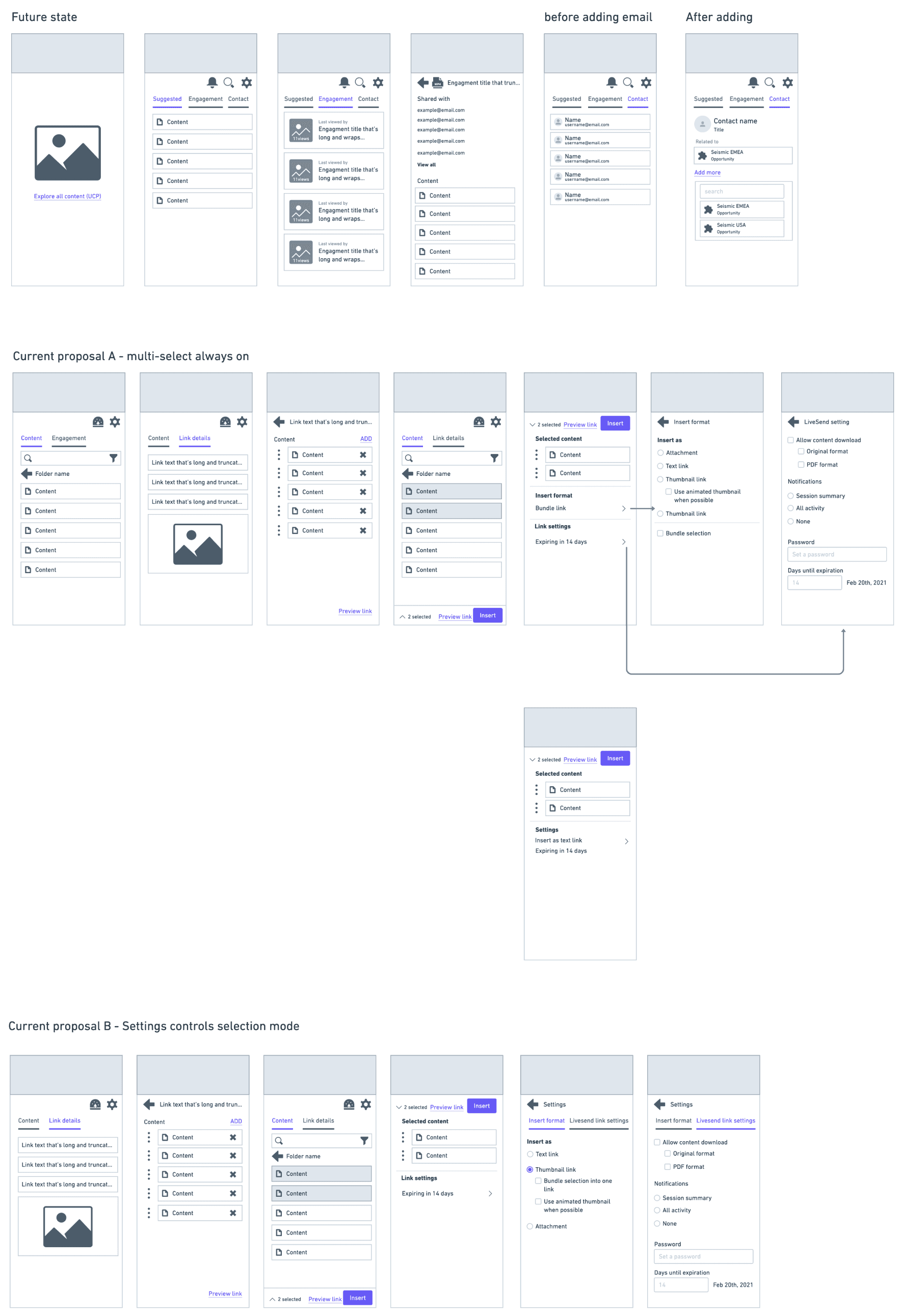
In addition to addressing the complexity of content adding choices, I'm grappling with several questions related to information architecture:
• How do we ensure a smooth transition for current add-in users into a new interface?
• How can users view and edit content already added in a bundled link?
• How do we create a scalable navigation system to accommodate future feature additions?
With these questions in mind, I started on exploring the information architecture for both the current project scope and its potential future evolution.
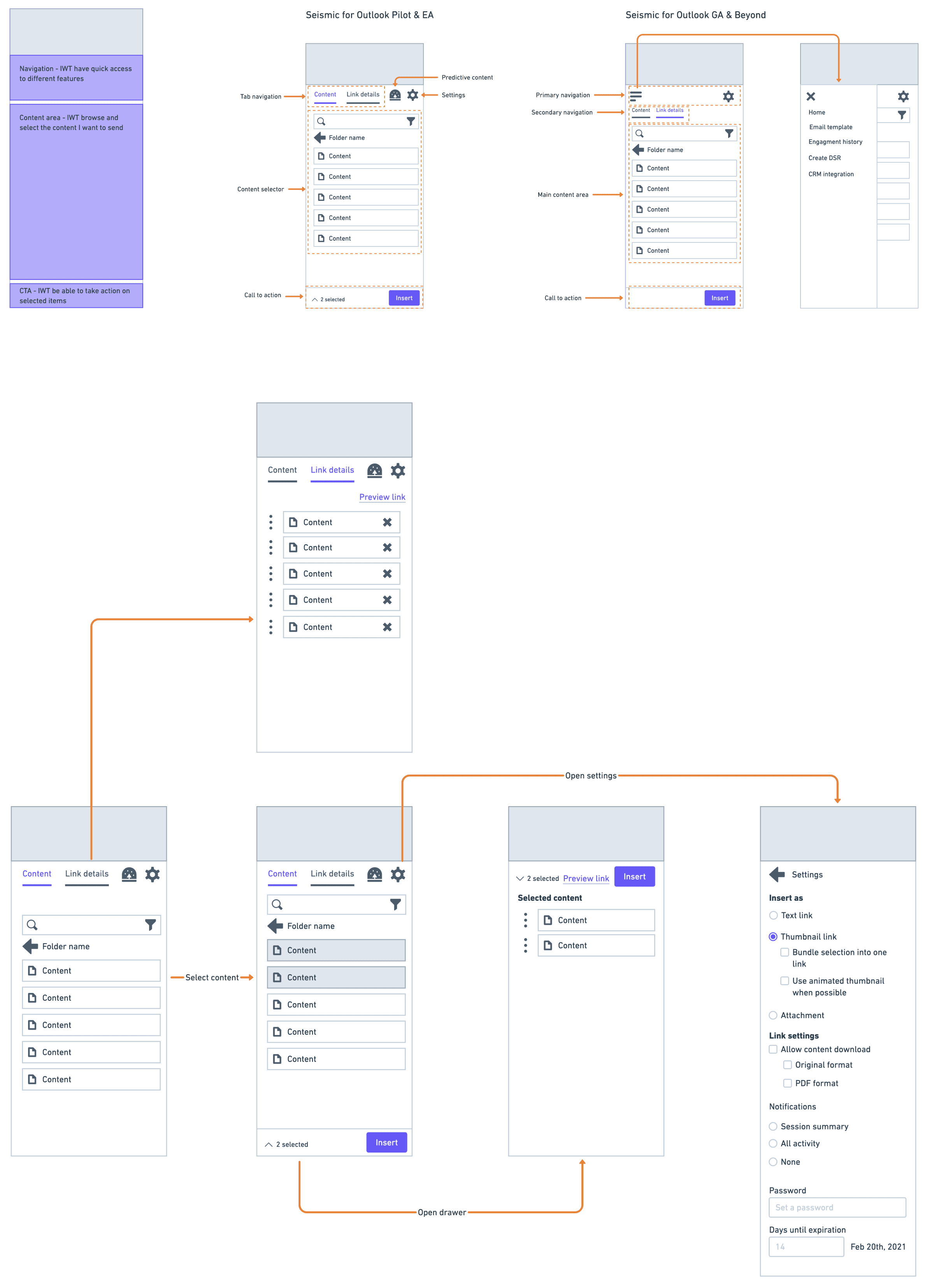
Here’s what I landed after the explorations:
Challenge 1: Simplifying Content Display Options
One of the primary challenges I tackled during wireframing was:
How might we prevent cognitive overload when presenting content display options to users?
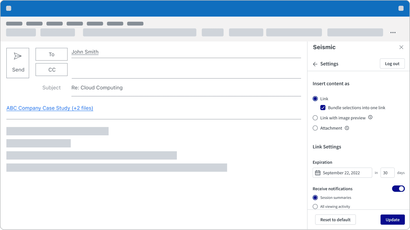
This question is crucial to address because, with the multitude of features mentioned earlier, we've ended up with five different options for how content can be displayed in the email body. Presenting all five options at once not only risks cognitive overload for users but also increases the likelihood of user errors.
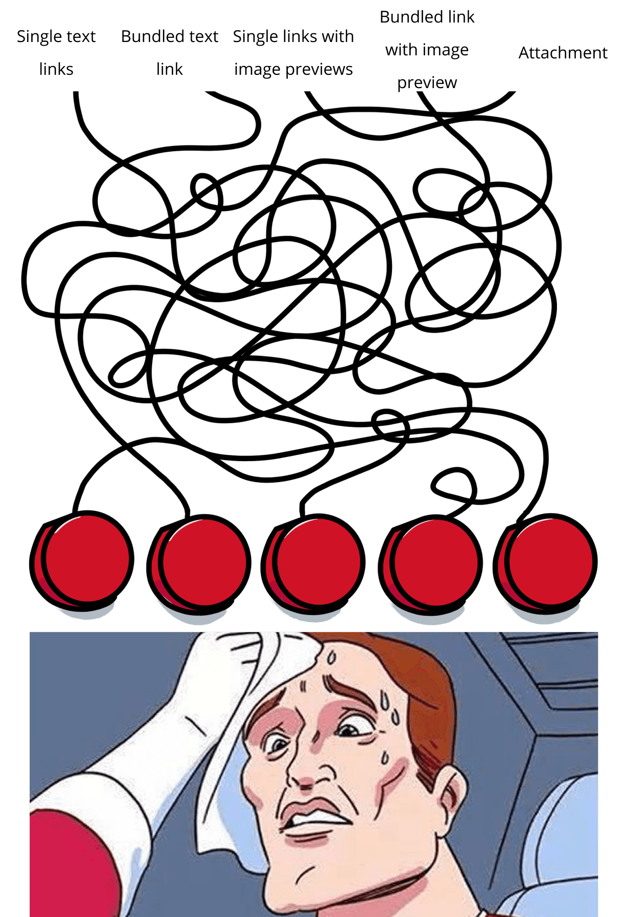
I've settled on a design that offers a clear structure for the available options. By categorizing bundle options as sub-options, I can present fewer options at once. As for attachments, given their distinct nature from the link options, there won't be a sub-option to bundle attachments, and link settings will also remain hidden.
Challenge 2: Simplifying Content Adding Workflow
In the previous version of the add-in, users were limited to adding one piece of content at a time. To use a grocery store analogy, this is equivalent to going through the checkout process every time they grab an item.
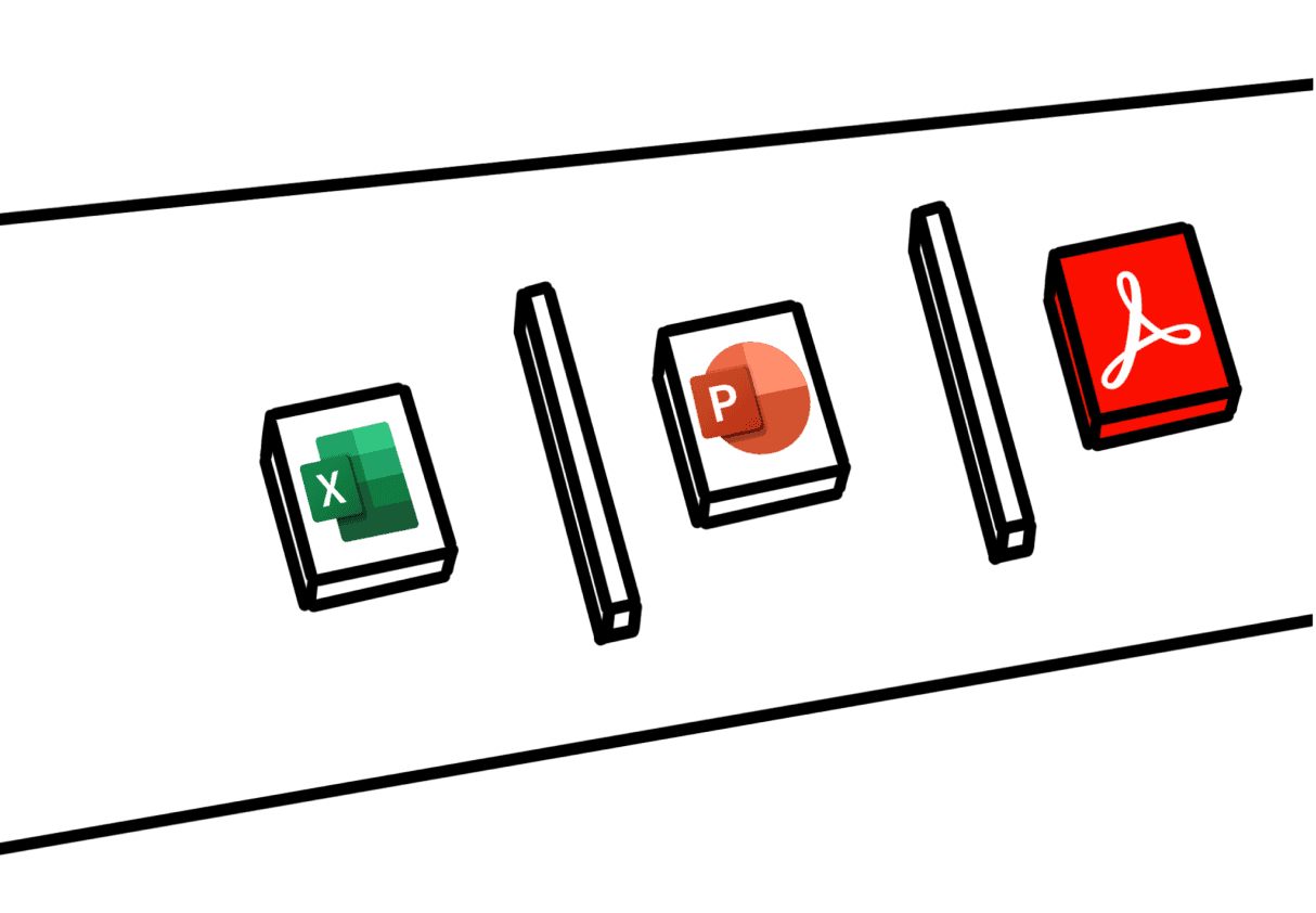
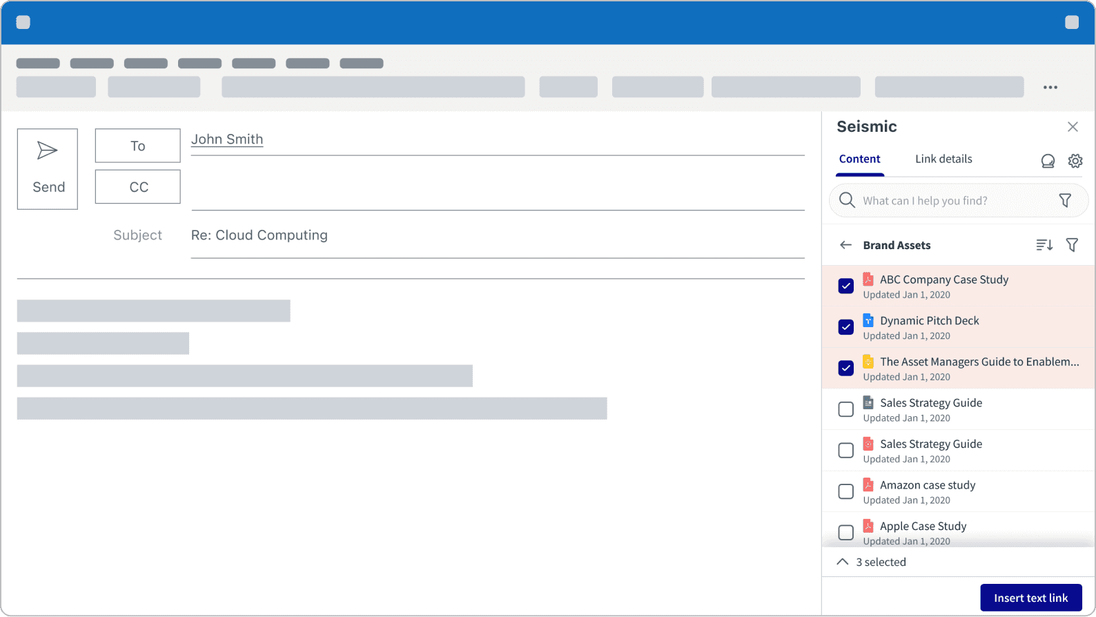
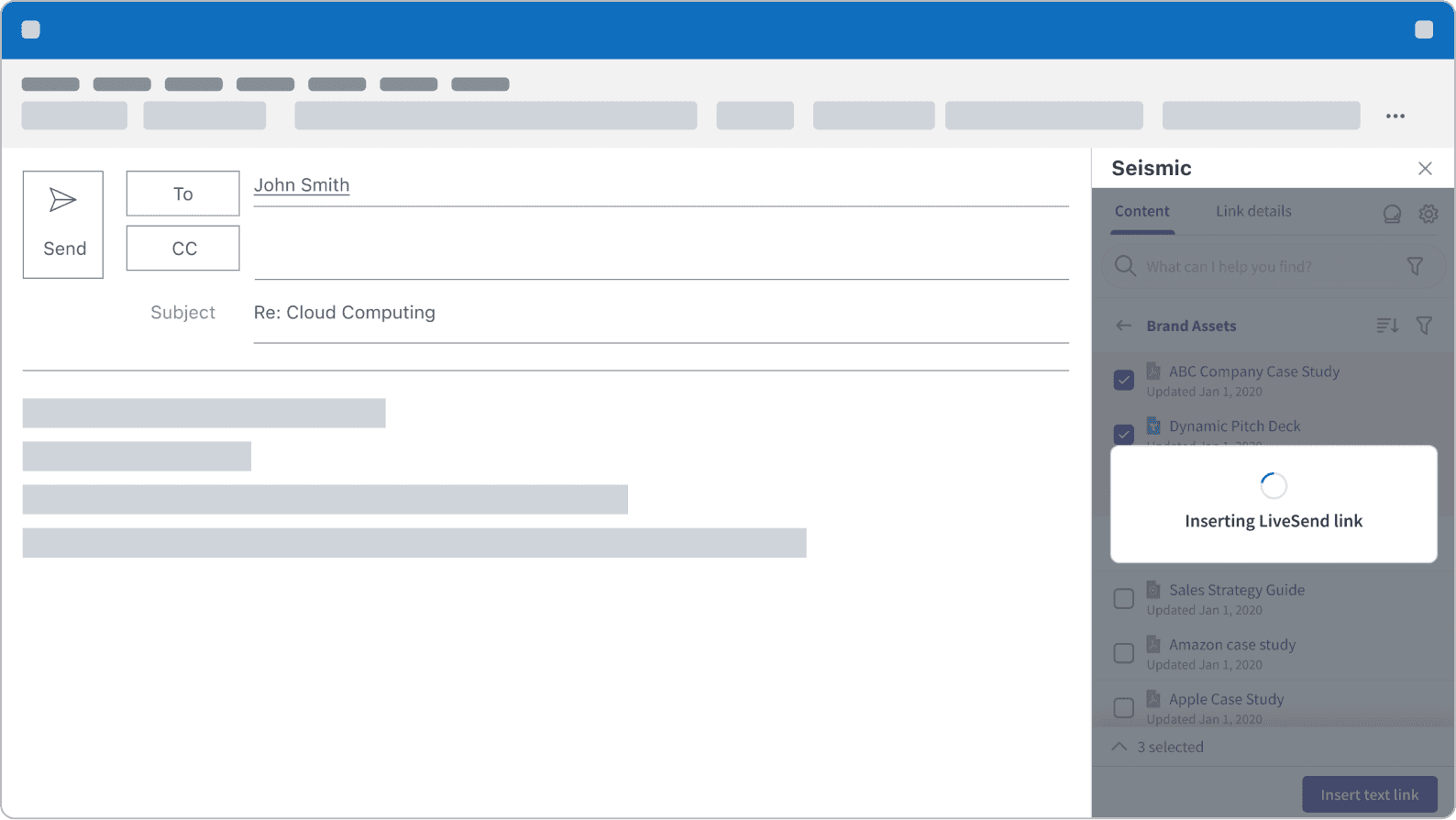
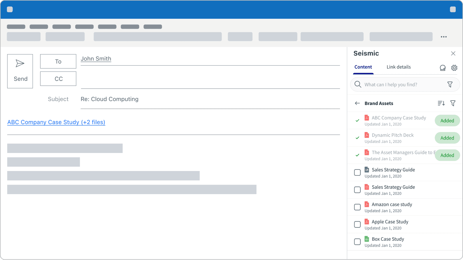
In fact, I used this grocery shopping analogy to persuade the Product Manager to adopt this new workflow. Now, users can multi-select content and with a single click, add all selected content into the email.
Challenge 3: Send Separate
The 'Send Separate' feature poses the greatest challenge in this project, primarily due to its technical complexities and the constraints associated with Microsoft integrations. Working closely with the engineering team, I conducted user interviews during the technical investigation phase. Through rapid adaptation and multiple iterations, we believe we've developed the best solution for our customers within our constraints.
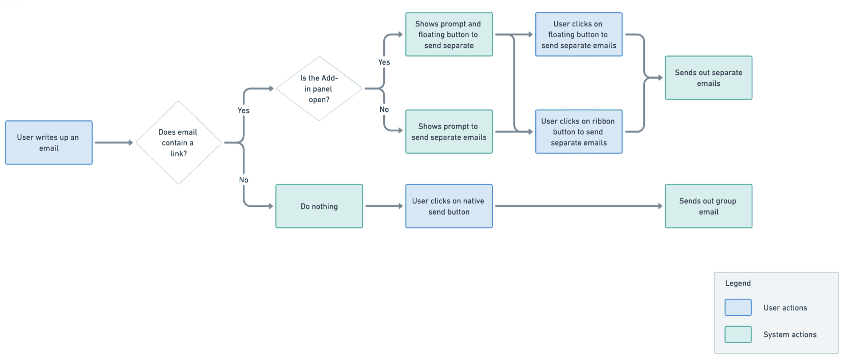
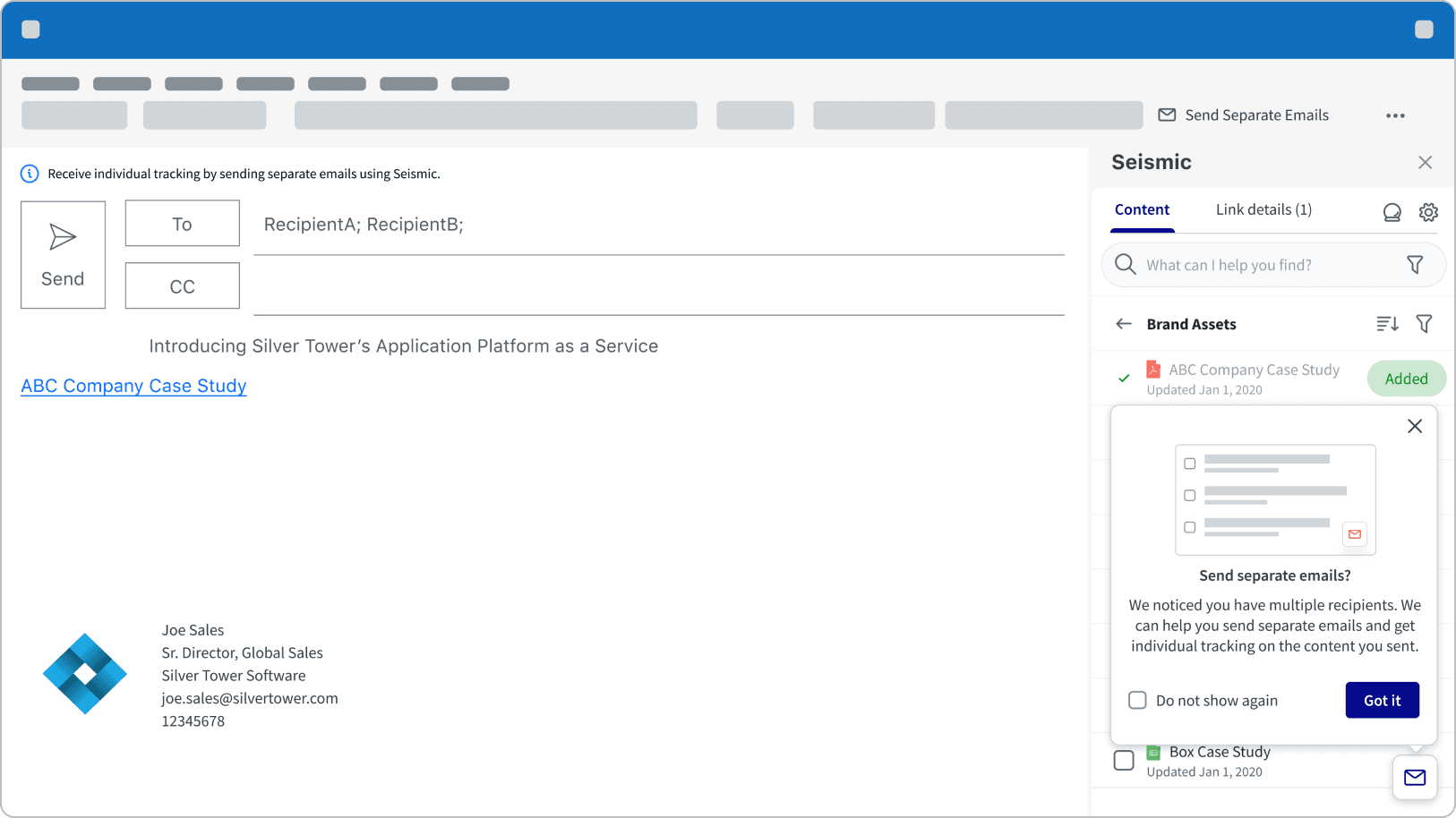
When a link and multiple recipients are present, we recognize the potential need to send separate emails to track individual content view times for each recipient. In response, we display a pop-up reminder to prompt users to utilize the 'Send Separate' feature.
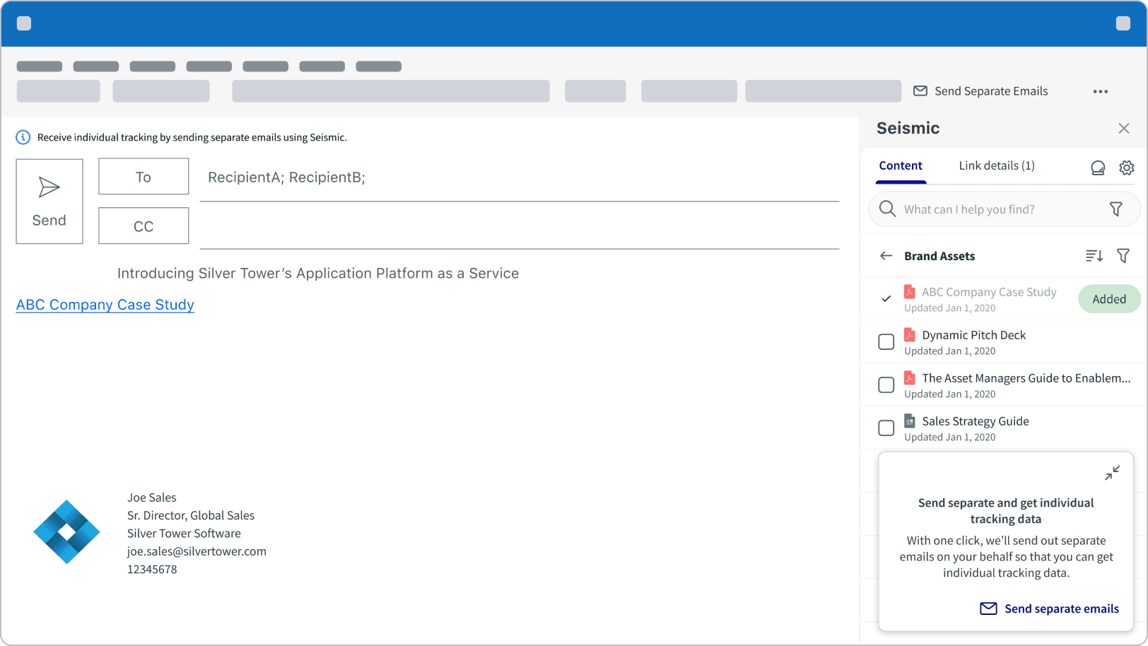
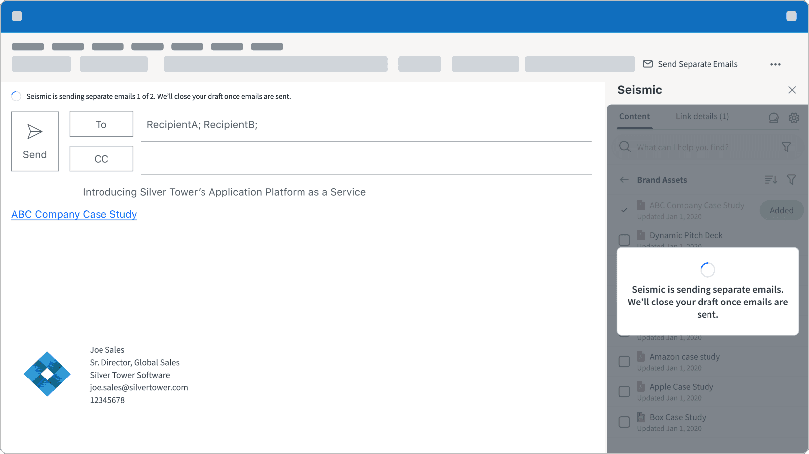
The user clicks on the floating button to open a card with a call-to-action. Clicking on 'Send Separate Emails' will trigger a loading state, and the separate emails will be sent out shortly thereafter.
Conclusion
I worked as the lead designer, collaborating closely with Product and Engineering to navigate numerous technical constraints. Playing a pivotal role in the journey, I successfully guided the team from the start to the general access launch of Seismic for Outlook. Furthermore, my work informed the direction for implementing similar functionalities on Seismic's web platform. I continued to influence and collaborate with the Seismic web email team, sharing insights and learnings to accelerate their feature development.